
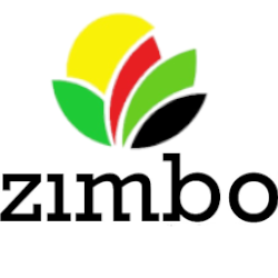
The Zimbo logo represents its agricultural focus wihle incorporating the national identity of Zimbabwe through its vibrant use of the flag’s colors. Here is an explanation of the design elements:
1. Colors:
- Yellow: Represents sunlight, prosperity and the importance of agriculture in sustaining life.
- Red: Symbolizes the strength and the resilience of the people involved in agriculture.
- Green: Stands for the land, growth and agricultural potential.
- Black: Represents the rich heritage and the unity of the people
2. Shapes:
- The rounded, leaf-like shapes signify growth, nurturing and the agricultural products Zimbo works to empower women and children to cultivate. The arrangement suggest collaboration, unity and transformation in Agriculture.
3. Typography:
- The bold and morden font of “Zimbo” reflects strength and forward thinking, emphasizing the brand’s innovative approach to agricultural empowerment.
4. Overal Message:
-
- The logo conveys Zimbo’s commitment to empowering women and children through sustainable agricultural practices while celebrating Zimbabwe’s identity and natural resources.
- The logo conveys Zimbo’s commitment to empowering women and children through sustainable agricultural practices while celebrating Zimbabwe’s identity and natural resources.